Article Detail
September 01, 2020
Mobile Design
WHAT IS A RESPONSIVE WEBSITE:
A single site that reacts to the size of a user’s device—with one URL and one content source. A responsive website has a fluid and flexible layout which adjusts according to screen size including:
- Readable text without requiring zoom
- Adequate space for tap targets
- No horizontal scrolling
FACTS ABOUT MOBILE DESIGN:
- As of July 2019, Google Search’s mobile-first indexing is enabled by default for all new websites
- Mobile viewing has now surpassed desktop web traffic with 60% of searches online now come from a mobile device.
- By the end of 2019, the number of mobile phone users is forecast to reach over 4.68 billion.
MOBILE DESIGN TIPS:
- Design: Web page design should factor in the variety of mobile devices used to view your site from the beginning of initial planning.
- Speed: Faster loading content is both helpful for both mobile and desktop devices. Use of appropriate image sizes and the use of caching can help in increasing your overall site speed.
- Structure: Organize both your page content and your url structures with a logical hierarchy. This provides for more accurate search indexing & results.
- Video & animation: Use HTML5 standard tags. Using flash or other license constrained media may provide a poor mobile experience.
Recent posts
Nov 18, 2025
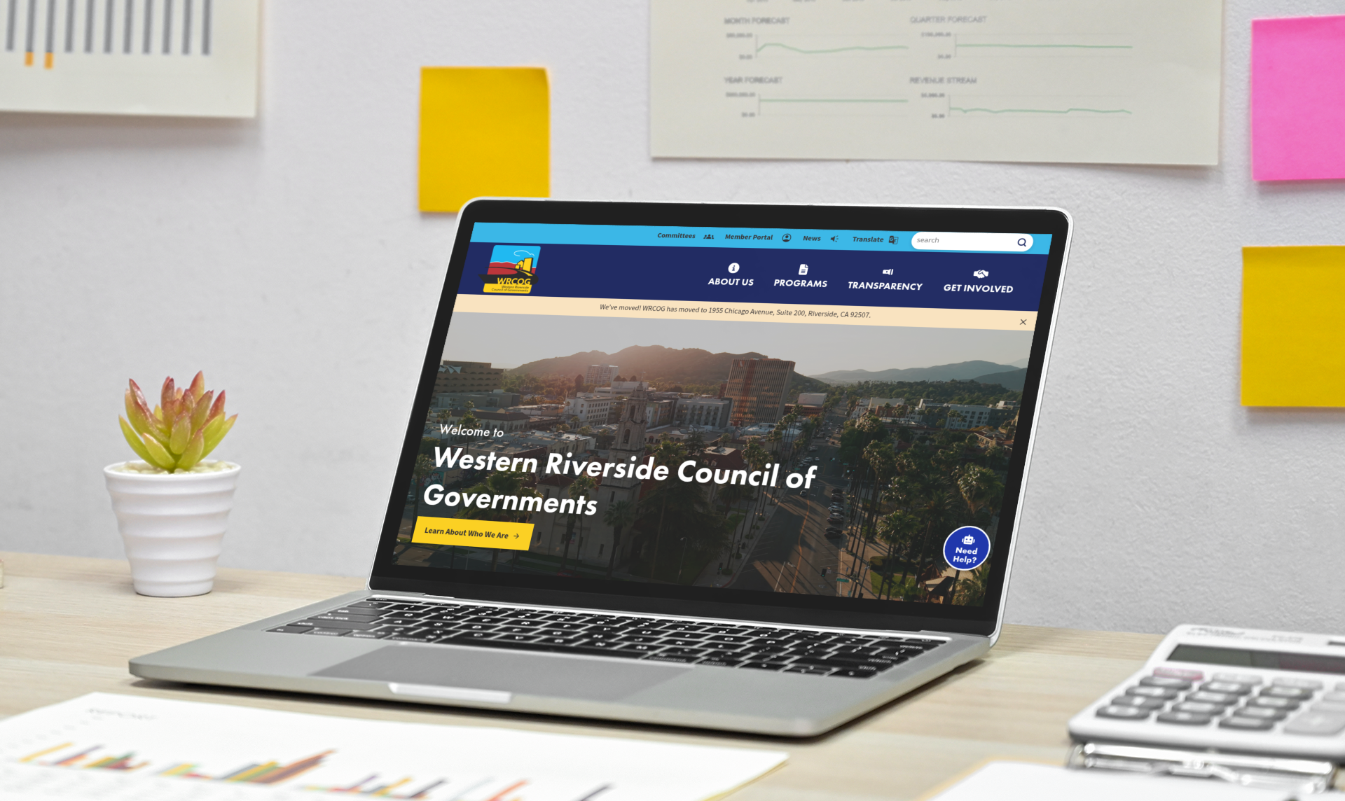
Western Riverside Council of Governments Launches a Modern, Accessible Regional Website
The Western Riverside Council of Governments (WRCOG) has launched its redesigned website, offering a modern,…
Oct 29, 2025
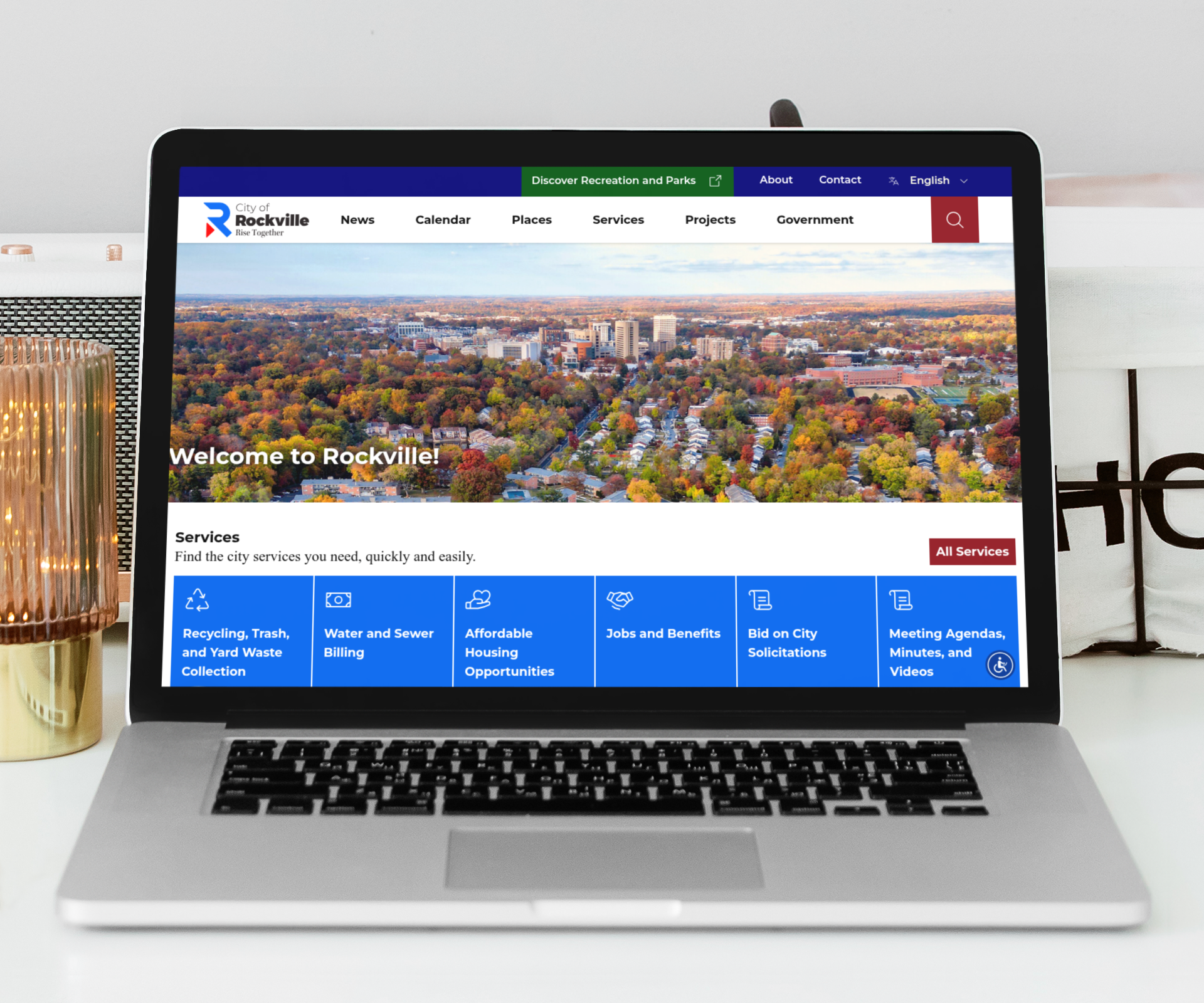
City of Rockville Launches Modern, Accessible Website
The City of Rockville has unveiled its redesigned website, offering residents, businesses, and visitors a…