Article Detail
December 17, 2025
One Website, Many Audiences: Why Economic Development Websites Are So Hard to Get Right
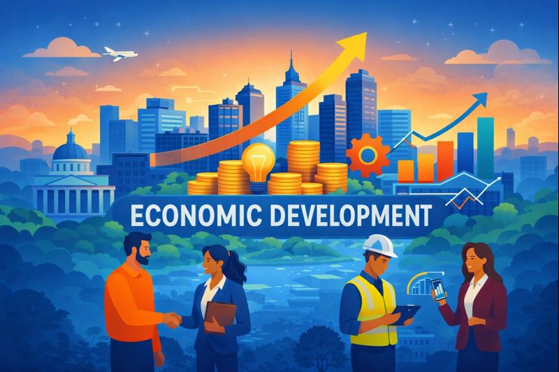
Economic development departments are asked to do more than almost any other public-facing organization. They support residents seeking opportunity, businesses looking to grow, entrepreneurs navigating complex programs, investors evaluating regions, and partners coordinating across agencies. Increasingly, all of those audiences are expected to be served through a single website.
That’s where the challenge begins.
One Website, Many Very Different Needs
Unlike traditional municipal websites, economic development sites rarely have a single “primary” user. Residents may arrive looking for housing resources or workforce programs. Small business owners want fast answers about eligibility, funding, or permits. Investors expect data, credibility, and a compelling story about place. Partners need clarity on initiatives, timelines, and impact.
Each of these audiences arrives with different goals, levels of familiarity, and expectations. When all of them are presented with the same navigation, the same language, and the same content structure, friction is inevitable.
The result is a website that technically contains everything—but feels difficult to use for everyone.
How Complexity Creeps In
Most economic development websites don’t become complex overnight. Complexity accumulates over time.
Programs are added to address new priorities. Grant initiatives launch quickly in response to funding cycles. Partnerships evolve. Content gets published by multiple teams with good intentions but limited coordination. Accessibility standards change. User expectations shift.
Eventually, the website reflects years of growth, adaptation, and urgency—but without a clear system holding it together. Navigation becomes dense. Pages get longer. Users are forced to read more than they should just to figure out where to start.
Importantly, this isn’t a failure of effort. It’s a natural outcome of a mission that keeps expanding.
The Real Problem Isn’t Design
When agencies recognize that their website isn’t working as well as it should, the instinct is often to focus on visual design. While design matters, it rarely solves the core issue on its own.
The real challenge is clarity.
Clarity about who the site is for.
Clarity about what each audience should do next.
Clarity about how programs relate to one another.
Without that clarity, even the most modern design will struggle.
What “Access Without Friction” Actually Means
Delivering access without friction doesn’t mean oversimplifying important programs or stripping away nuance. It means structuring information in a way that respects users’ time and intent.
In practice, that often looks like:
- Clear audience-based pathways instead of long program lists
- Plain, direct language that explains eligibility and next steps
- Navigation that guides users rather than asking them to explore endlessly
- Search and filtering tools that surface relevant content quickly
- Accessibility built into layouts, templates, and content workflows—not added later
When done well, users feel confident they’re in the right place and understand what to do next. That confidence is what turns information into action.
Accessibility Is Part of Clarity
Accessibility is sometimes treated as a compliance requirement, separate from usability. In reality, the two are closely linked.
Websites that are accessible—clear headings, readable contrast, logical structure, predictable navigation—are easier for everyone to use. When accessibility is considered early, it reinforces clarity rather than competing with it.
For economic development agencies, accessibility isn’t just about meeting standards. It’s about ensuring that opportunity isn’t limited by design choices.
A Shift in Mindset
The most successful economic development websites share one thing in common: they are treated as systems, not brochures.
They are designed to evolve.
They acknowledge internal workflows and content ownership.
They prioritize structure before aesthetics.
Rather than trying to say everything to everyone at once, they guide users through complexity with intention.
As economic development missions continue to expand, websites must do more than look modern. They must help agencies communicate clearly, deliver access without friction, and support opportunity in all its forms.
That’s not a small task—but it’s an essential one.
Send Us A Message
Recent posts
Jan 23, 2026
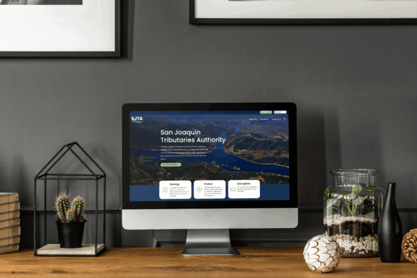
New Website Launch: San Joaquin Tributaries Authority
The San Joaquin Tributaries Authority (SJTA) officially launched its redesigned website on January 20, marking…
Nov 18, 2025
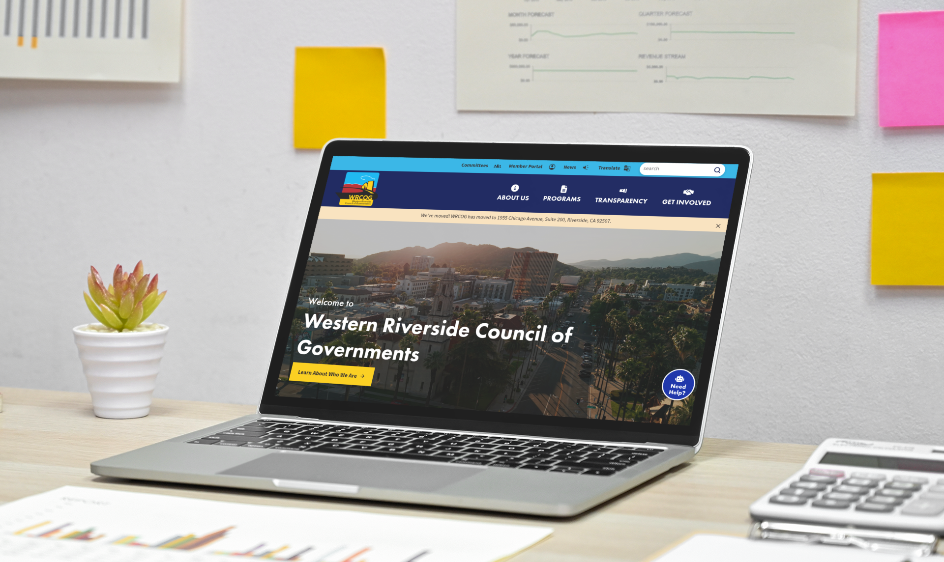
Western Riverside Council of Governments Launches a Modern, Accessible Regional Website
The Western Riverside Council of Governments (WRCOG) has launched its redesigned website, offering a modern,…