Article Detail
February 23, 2026
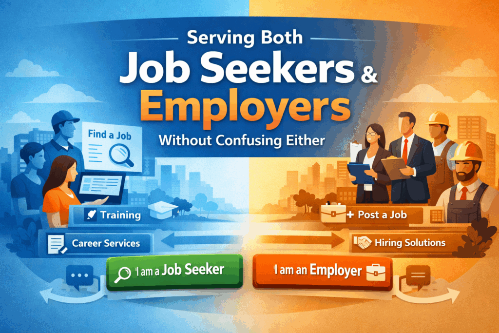
Serving Both Job Seekers and Employers Without Confusing Either
Workforce development agencies operate in one of the most complex digital environments in the public sector.
You are not serving one audience. You are serving two completely different groups — job seekers and employers — each with distinct goals, urgency levels, terminology, and service pathways.
Yet many workforce websites attempt to speak to both audiences at the same time… on the same pages… with the same navigation.
The result? Confusion. Higher bounce rates. Increased call volume. And missed opportunities.
Here’s how modern workforce agencies can structure their websites to clearly separate pathways while keeping navigation intuitive and accessible.
The Core Challenge: Two Audiences, Two Mindsets
Job seekers typically visit your site to:
- Find open positions
- Get training or certification support
- Apply for assistance programs
- Schedule appointments
- Understand eligibility requirements
Employers, on the other hand, are looking to:
- Post job openings
- Access hiring incentives
- Connect with sector partnerships
- Schedule recruiting events
- Understand business services
These are fundamentally different journeys.
If your homepage blends messaging like “Find a Job” next to “Layoff Aversion Services” next to “Board Meeting Minutes,” you are forcing users to self-sort through clutter.
Modern workforce websites must make the choice obvious immediately.
Strategy #1: Split the Experience at the Top Level
The most effective workforce sites introduce two clear entry points directly on the homepage:
I Am a Job Seeker
I Am an Employer
This isn’t just a design choice — it’s an information architecture decision.
Once a user selects their pathway, the navigation, featured tools, calls to action, and content hierarchy should shift to support that audience’s goals.
This reduces cognitive load and helps users find what they need faster.
Strategy #2: Use Parallel Navigation Structures
Each audience pathway should have its own structured navigation, built around user intent rather than internal department structure.
For example:
Job Seeker Navigation Might Include:
- Find a Job
- Training & Certifications
- Career Counseling
- Youth Services
- Events & Workshops
- Eligibility & Enrollment
Employer Navigation Might Include:
- Post a Job
- Hiring Incentives
- Rapid Response Services
- Sector Partnerships
- Workforce Grants
- Recruitment Events
Notice the difference: these are outcome-driven labels, not program names.
Users should not have to understand WIOA terminology to navigate your website.
Strategy #3: Keep Shared Content Clearly Separate
There will always be shared content — such as board information, public notices, performance reports, and policy documents.
The key is to isolate these into a clearly labeled section like:
- About the Agency
- Board & Governance
- Reports & Transparency
- News & Updates
This ensures compliance and transparency without interrupting the service-focused pathways for job seekers and employers.
Strategy #4: Design With Visual Cues
Information architecture isn’t just structural — it’s visual.
Strong dual-audience websites often use:
- Distinct color accents for each pathway
- Iconography that signals audience type
- Clear section headers
- Consistent call-to-action buttons
When done correctly, users always know where they are in the experience.
This reduces frustration and improves engagement.
Strategy #5: Make Self-Service the Priority
Both audiences increasingly expect digital self-service options.
For Job Seekers:
- Online intake forms
- Appointment scheduling
- Event registration
- Training eligibility tools
For Employers:
- Job posting submission forms
- Employer service request forms
- Incentive application portals
- Event sponsorship registration
When these tools are placed prominently within each pathway, agencies reduce staff burden and improve response times.
Strategy #6: Don’t Let Your Internal Org Chart Dictate UX
One of the most common workforce website mistakes is organizing content by internal department structure.
Users do not think in terms of:
- Adult Programs
- Dislocated Worker Unit
- Business Services Division
They think in terms of outcomes:
- “I need a job.”
- “I need workers.”
Your website architecture should reflect that reality.
Strategy #7: Mobile-First Is Non-Negotiable
Many job seekers access workforce services on mobile devices.
If your dual pathways collapse poorly on mobile — or if navigation becomes cluttered — your most vulnerable populations will struggle to access services.
Mobile-first architecture ensures:
- Clear buttons
- Stacked navigation
- Easy tap targets
- Fast load times
Accessibility and usability must work together.
Strategy #8: Use Smart Search and Guided Chat
Even with strong architecture, some users will still search.
AI-powered search and guided chat tools can:
- Direct job seekers to the correct intake form
- Route employers to business service contacts
- Answer eligibility questions
- Reduce repetitive phone inquiries
When layered onto strong information architecture, these tools dramatically improve user success rates.
What a Modern Workforce Website Should Feel Like
A well-structured workforce website should feel like:
- A digital workforce hub
- A guided service platform
- A simplified intake system
- A resource center built around real user needs
It should not feel like a document repository.
Final Thought: Clarity Drives Outcomes
Workforce agencies play a critical role in economic mobility and regional growth.
But if job seekers and employers cannot quickly identify where to start, your digital platform becomes a barrier instead of a bridge.
Separating pathways while keeping navigation intuitive isn’t just a design improvement — it’s a service delivery improvement.
When done correctly, your website becomes an extension of your mission.
Need to Modernize Your Workforce Website?
If your agency is serving both job seekers and employers on the same platform, but your navigation hasn’t evolved to support that complexity, it may be time to rethink your information architecture.
A modern workforce website should:
- Clearly separate user pathways
- Simplify program discovery
- Support compliance and transparency
- Reduce staff workload
- Improve measurable engagement
When structure supports mission, everyone benefits — especially the communities you serve.
Send Us A Message
Recent posts
Feb 25, 2026
Valley Mountain Regional Center Launches Modern, Accessible Website
Valley Mountain Regional Center (VMRC) has officially launched its newly redesigned website, delivering a modern,…
Jan 23, 2026
New Website Launch: San Joaquin Tributaries Authority
The San Joaquin Tributaries Authority (SJTA) officially launched its redesigned website on January 20, marking…